Case Study: Building the Quantum K4 Brand
Introduction
Quantum K4 was a Canadian brand selling nutritional supplements based on natural ingredients. In 2025, we collaborated with them to develop their brand identity, product packaging, and web presence.
Branding and Identity Design
The starting point was the logo. It was the only existing element when the project began, so our early exploration used it as the foundational block for building a coherent visual system. We defined color palettes, typography, and supporting graphic elements aligned with core brand values: health, wellbeing, and holistic renewal.

Our goal was to give the brand a distinctive “taste”, combining patterns inspired by phenomena like wave interference and cymatics, evoking vibration, energy, and resonance: concepts aligned with the word “Quantum” and the brand promise of holistic renewal.
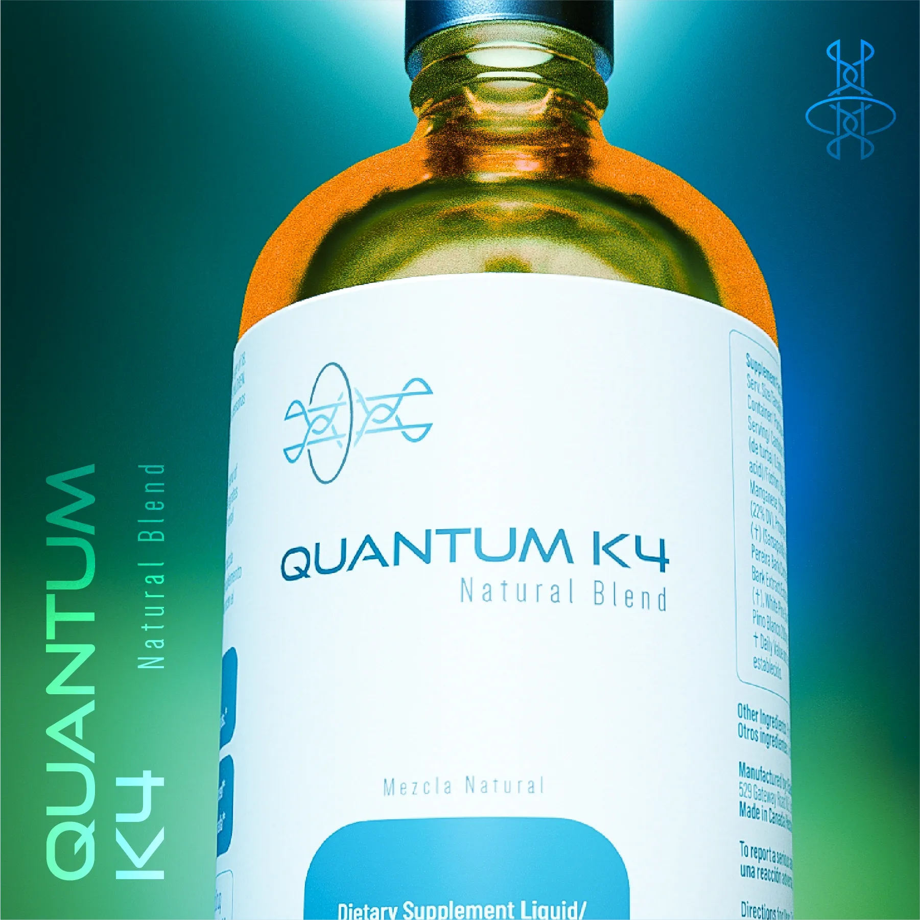
Color choice also carried meaning. Blue and green tones suggest trust, health, and nature, while orange accents bring vitality and energy. We used generative tools to create images that more explicitly communicate supplement benefits, representing vital organs and physiological elements being revitalized by the products.
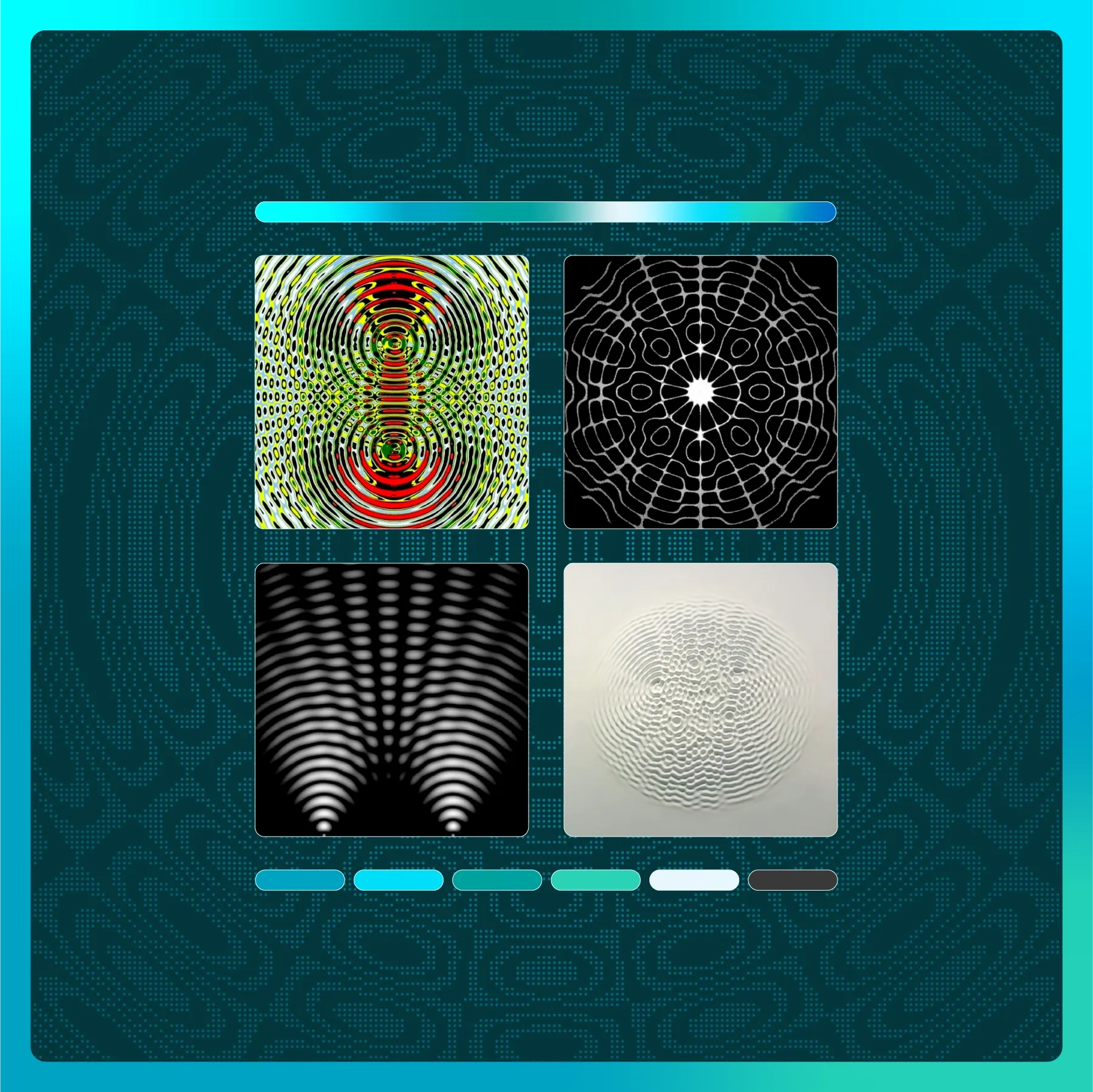
Using Code as a Design Tool
This is where our multidisciplinary approach differentiates us: to capture wave interference behavior in the exact way we wanted, we built custom scripts to generate wave interference visualizations. We tuned parameters to discover specific patterns, then refined and stylized them for use in the visual identity system. Try playing with the parameters in the interactive simulator below:
Explore like us. Drag the points or use the controls to move the sources.
As you can see, this method enables parametric exploration. We knew interference patterns fit the brand symbolism, but we wanted to discover the right expression. Drawing these patterns manually is difficult and time consuming; with code, iteration is fast. Code becomes an exploratory medium that, combined with aesthetic judgment, leads to unique and meaningful outcomes.
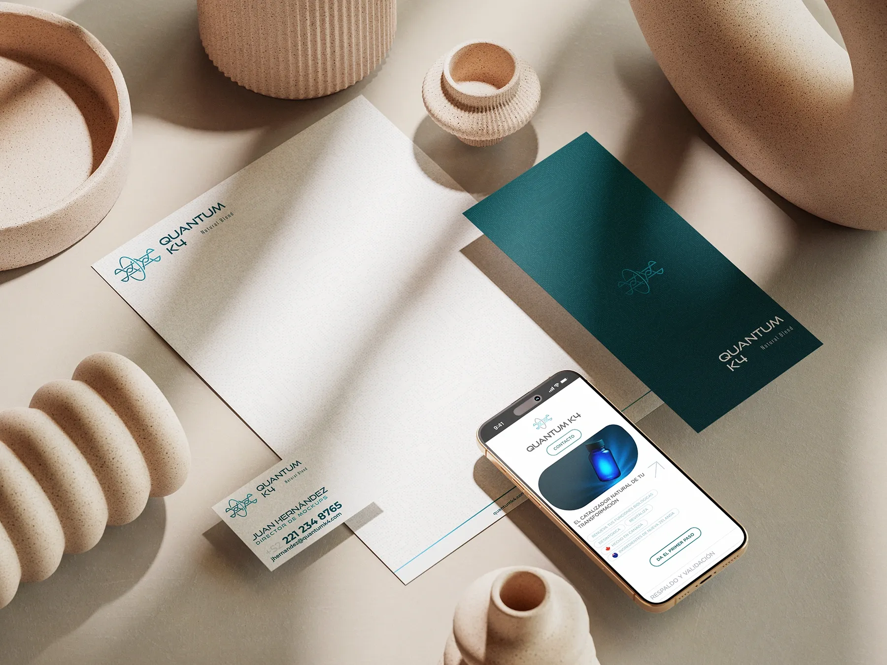
Together, these elements form a coherent and compelling identity that communicates Quantum K4’s mission clearly. Once identity foundations were established, we instantiated the brand across practical outputs: stationery, packaging, and website.
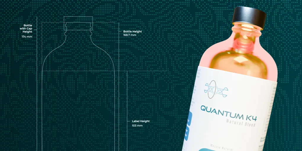
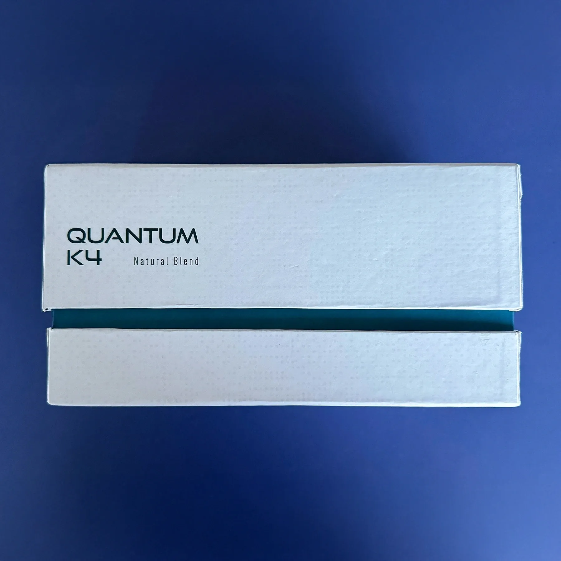
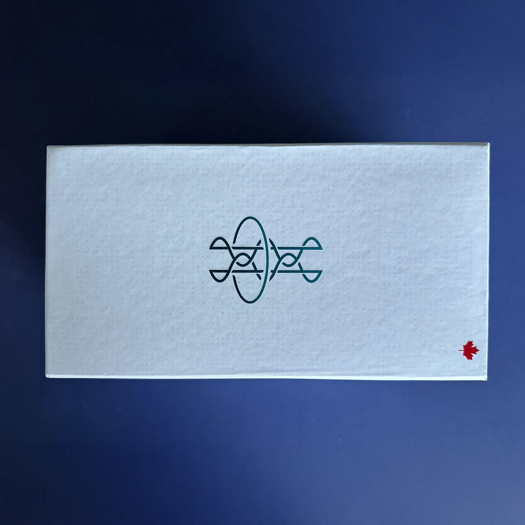
Packaging Design, Prototypes, and 3D Renders
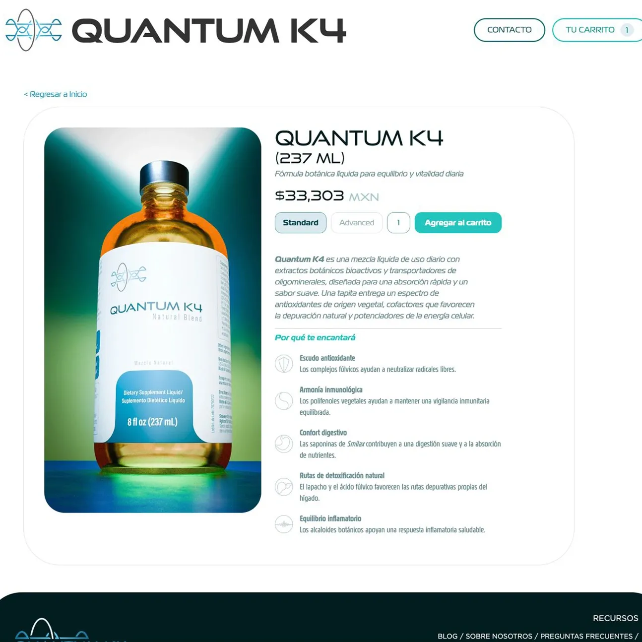
The second challenge also started with an existing constraint: bottle dimensions were already defined by the manufacturer. We used those technical specs as the starting block, then designed labels that integrated the visual identity to ensure consistency and recognition.
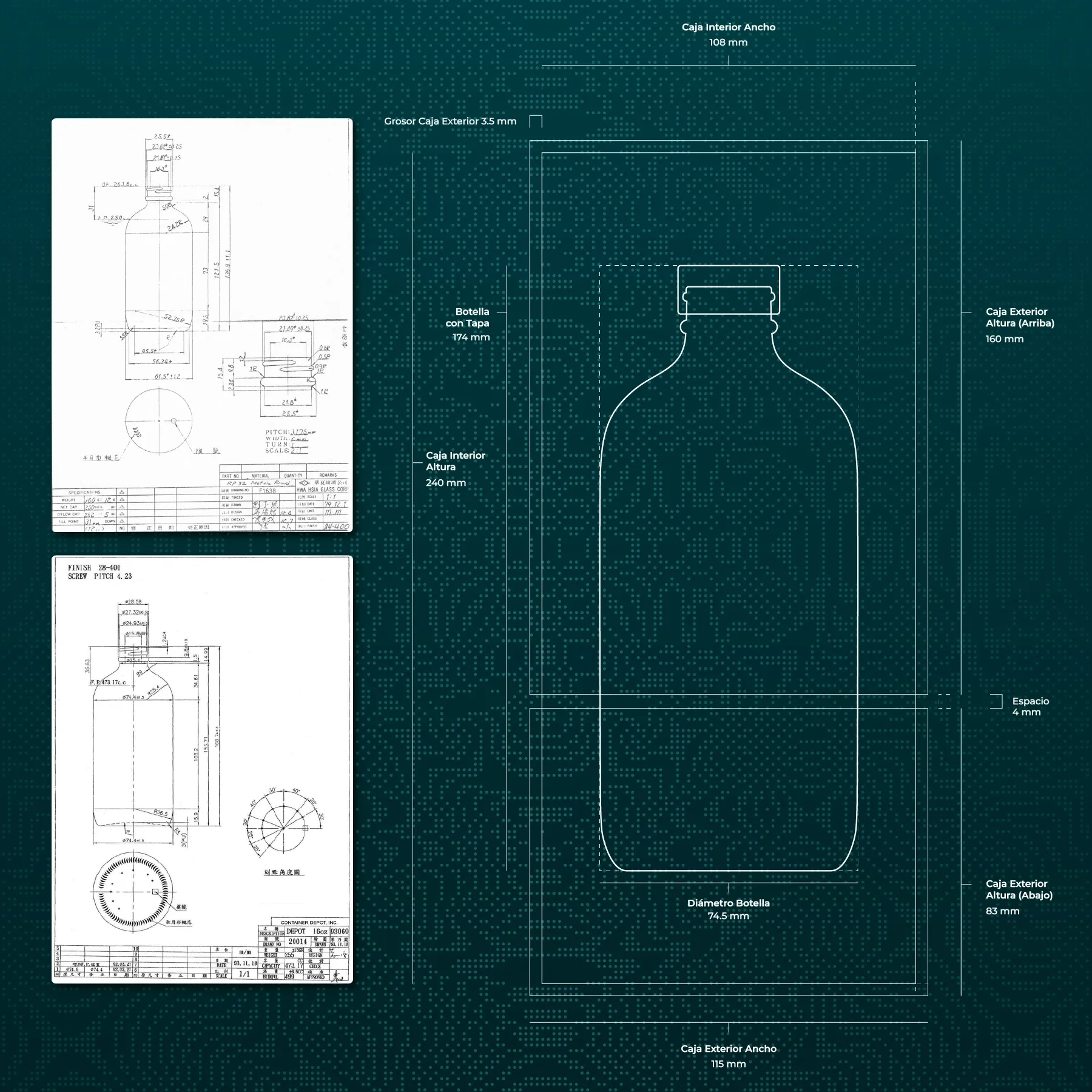
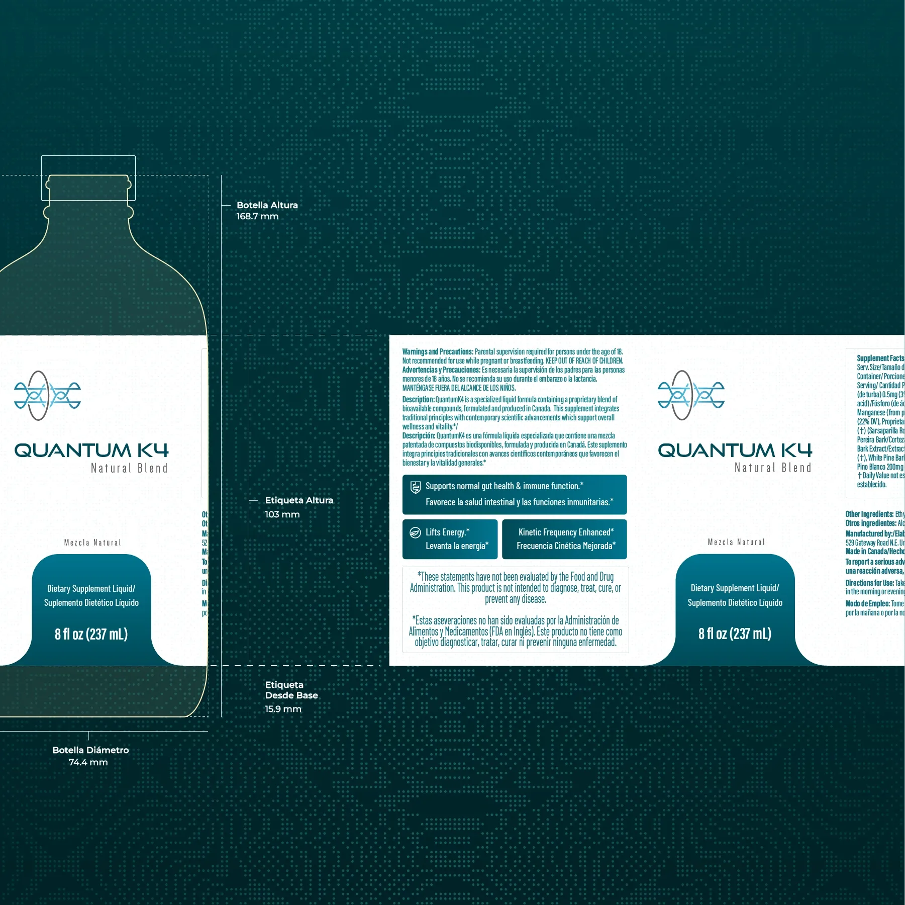
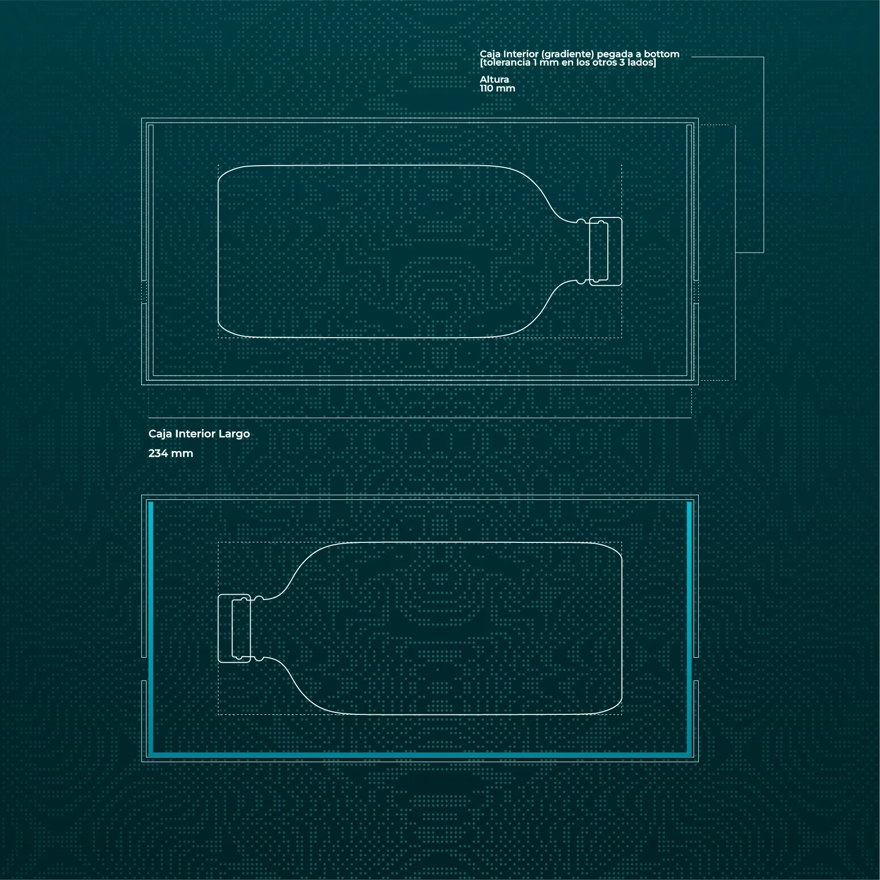
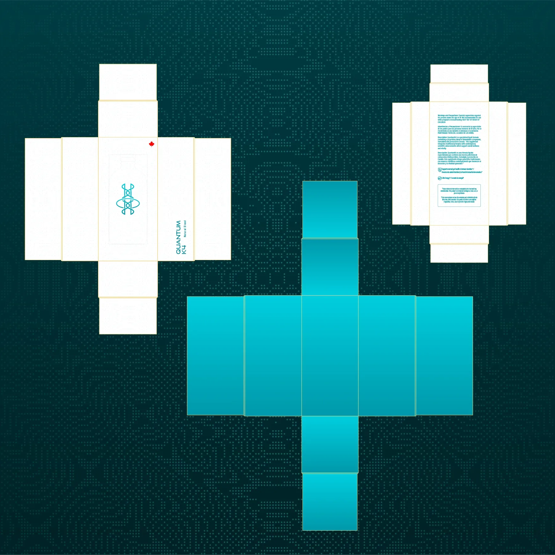
The schemes above were used to produce physical prototypes, a key step for validating readability, visual appeal, and functional behavior in real context.
Each stage built on the previous one. After defining labels and box structures, we complemented the process with photoreal 3D renders to preview the product in different contexts.
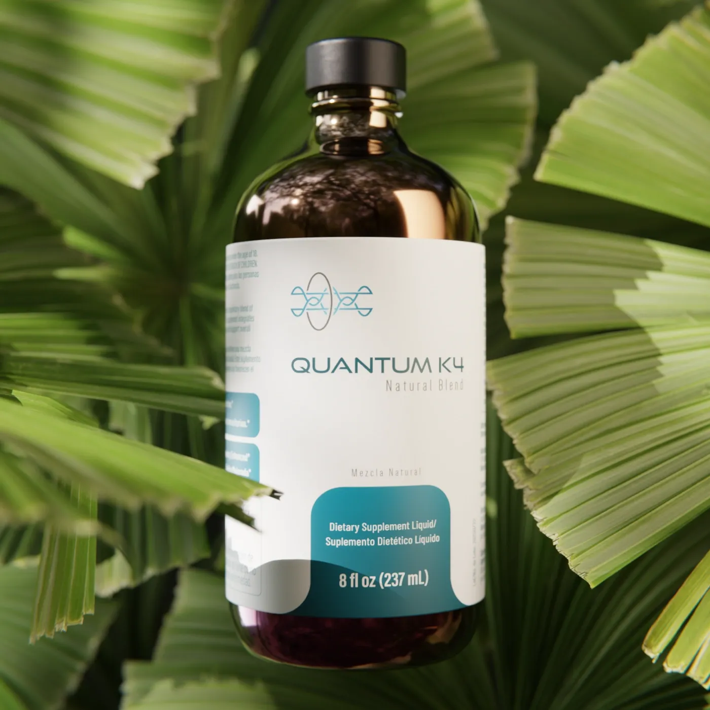
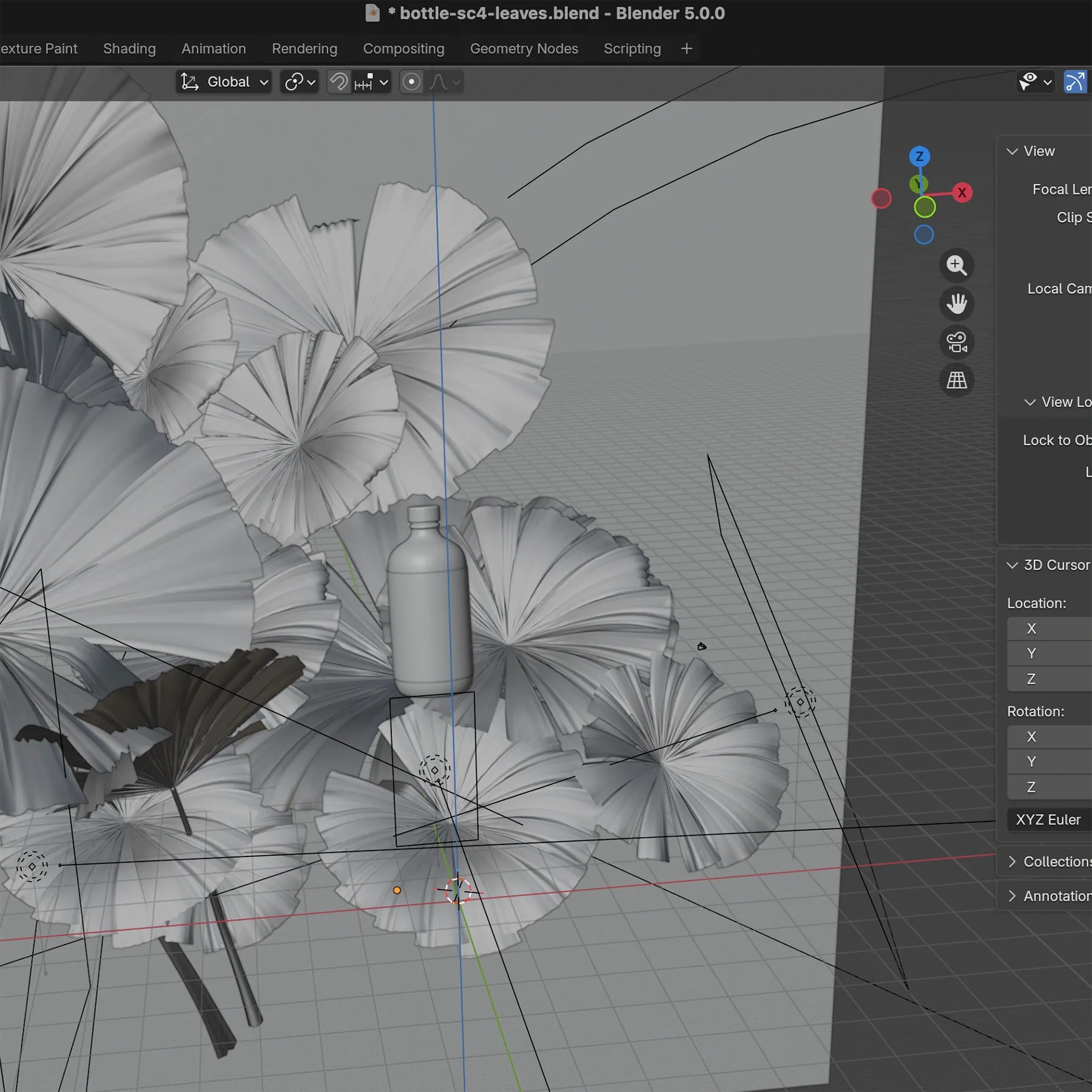
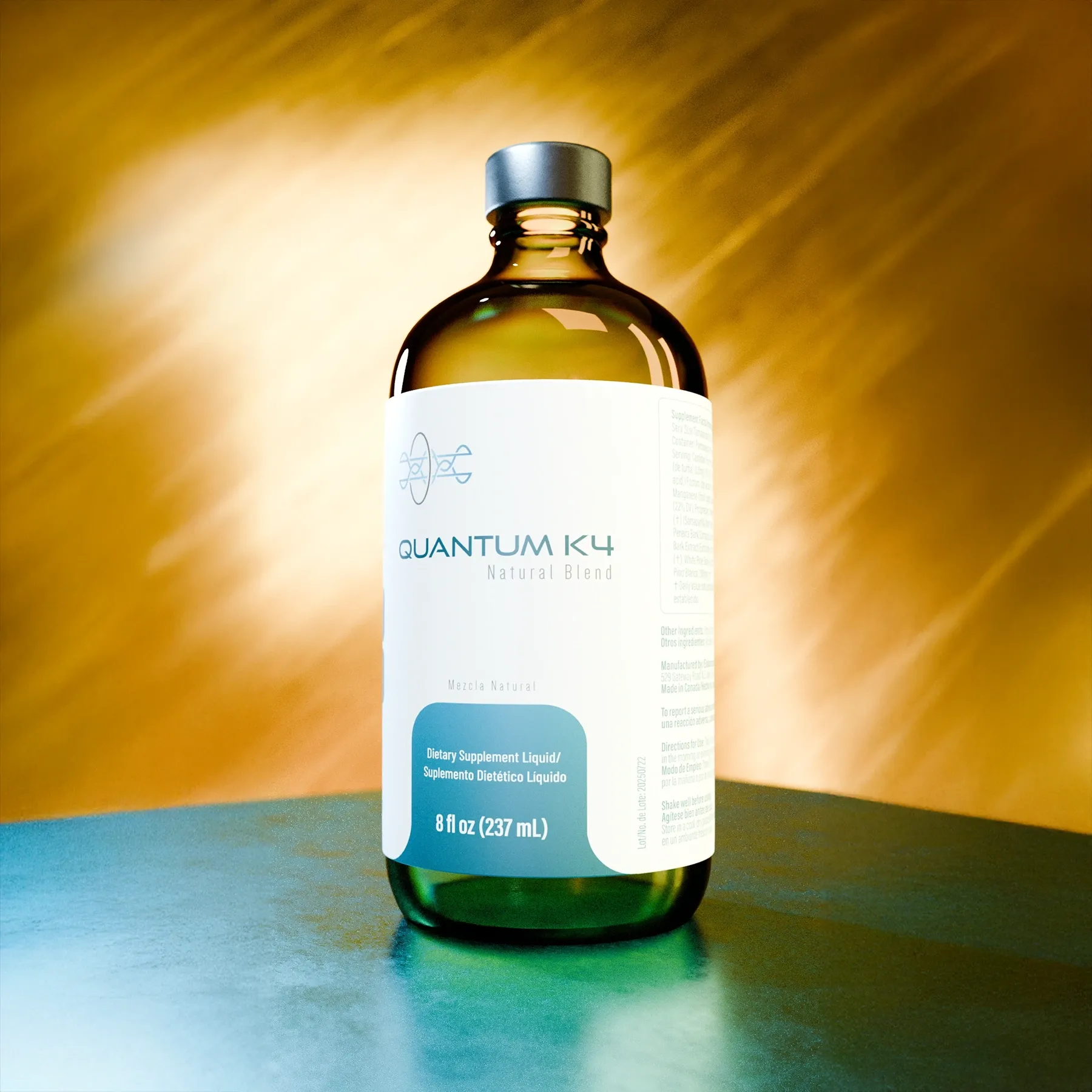
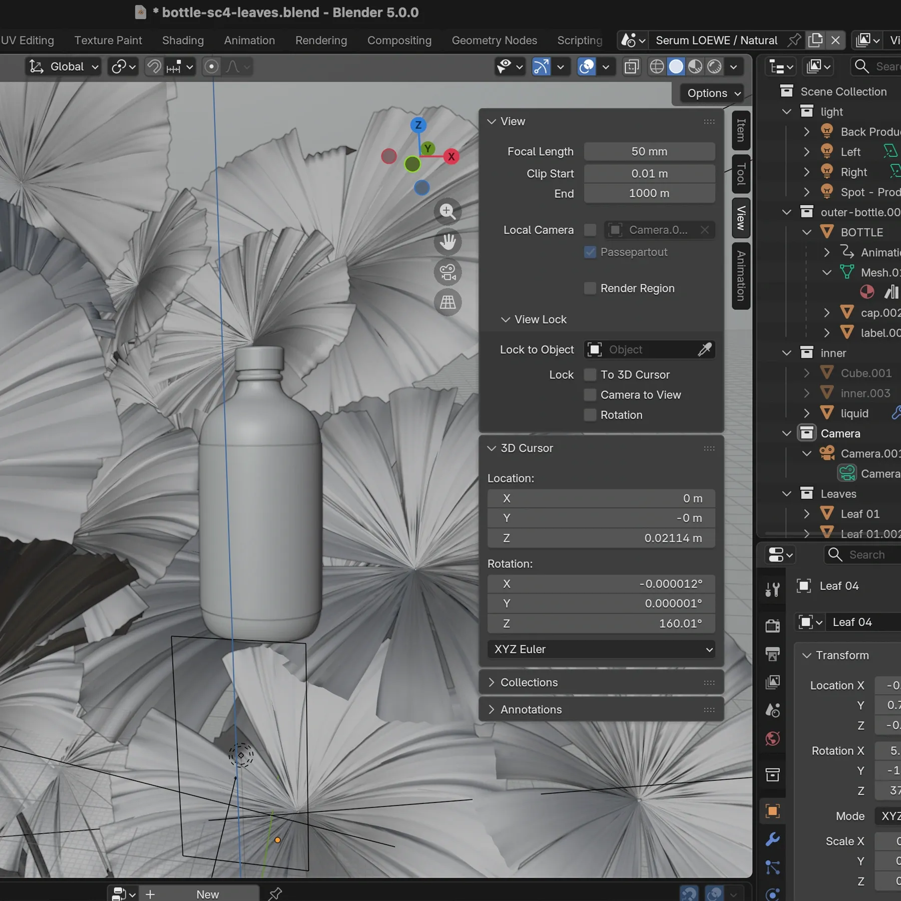
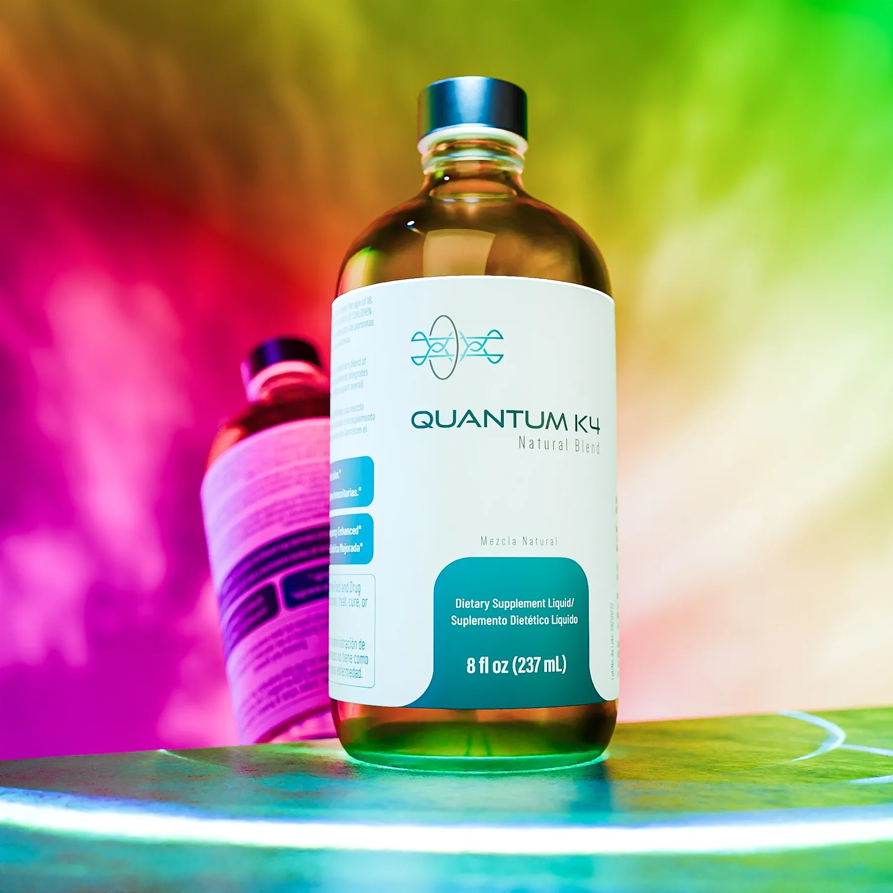
3D models are not only for previewing final product appearance. They are also high-value assets for print, marketing, and web content production.
Want to know more about how we modeled and rendered this bottle? We walk through it in this blog post.
Website and Ecommerce
With a solid visual identity and product assets ready, we moved to implementing the Quantum K4 website. We built specific functionality for brand needs, including localization (English/Spanish), ecommerce integration, and SEO optimization.
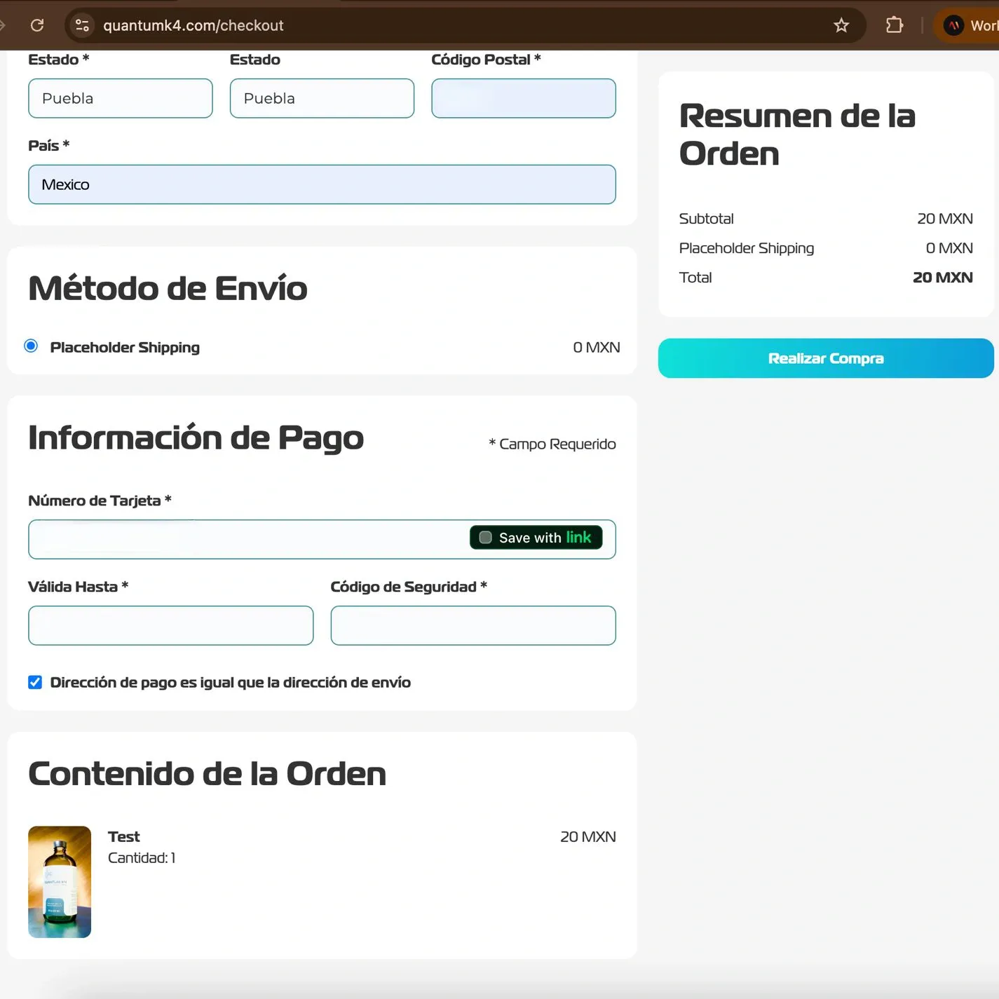
The website became the final piece connecting all previous deliverables. Together with the broader system of brand assets, it meant the brand was ready to engage its audience and grow in the market.
Our involvement in Quantum K4 covered additional areas, including brand strategy, visual content production, and fundraising support. To keep this case study concise, we focused on the most visually clear and high-impact parts: creating a brand from scratch and implementing core touchpoints that shape public perception.
We hope this walkthrough clearly communicates how we can contribute to your own project. If this case study resonates, feel free to contact us, we can’t wait to discuss your next challenge.
The brand continued evolving and in 2026 changed its name to 'Vilixium'.
This project was developed in collaboration with Avanta Design.